Prompt
Create a brand and apply a design system & Figma component library
Tools
Figma, After Effects
Time
12 weeks
Concept
Design system
Overview
Problem
RUNR, an imaginary car company needs a new look that will adapt across all their digital products.
Guiding Question
How can we keep a consistant brand across all RUNR digital products?
Solution
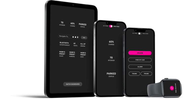
A new branding guide, design system, and Figma component library to update RUNR's vibe.
Applied across the RUNR desktop website, digital dashboard, mobile app, and wearable app.
Animated Prototype
Branding Guidelines
Identity
RUNR is an imagined electric vehicle company with a full suite of digital products to enhance user experience.
Logo
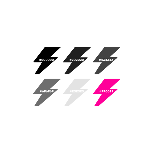
The RUNR logo has fluid lines to evoke speed.
Color
A high-contrast color pallet personifies electricity and innovation.

Typography
The typeface Rubik promotes modernism, with a roundness that echos RUNR’s fluid lines.
Look & Feel
RUNR has a dark theme built around contrast and bold use of color.
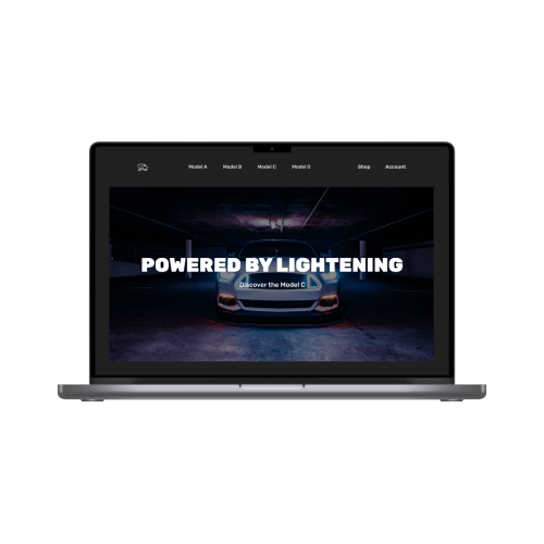
Photo Treatment
Photographs can be used to add texture and interest to backrounds.
Grid Systems
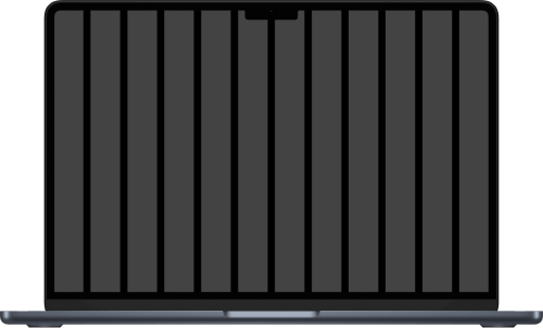
12 Columns
1440 x 1024
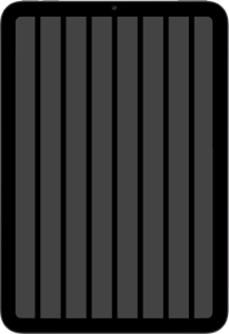
8 Columns
744 x 1143
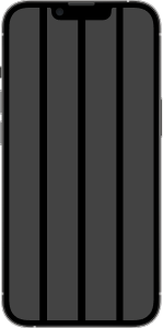
4 Columns
390 x 844
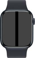
2 Columns
198 x 242
Figma Component Library
Interactive Components
The RUNR component library has design elements made into Figma components so they can seamlessly adapt to different screen sizes.
Interactive components can each be set to five states - rest, hoover, click, error, and disabled - to accommodate all use cases and streamline the prototyping process.
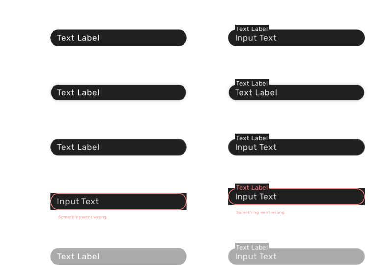
Text Field
Text fields let users edit text.
Chips
Chips represent an attribute.
Drop Down
Drop downs organize content across screens.
Radio Buttons
Radio buttons allow users to select one option.
Check Boxes
Checkboxes allow users to select several options.
Sliders
Sliders let users select from a range
Switches
Switches toggle an item on or off.
Buttons
Buttons allow users to take actions.
Icons
Icons show info without using words.
User Journey
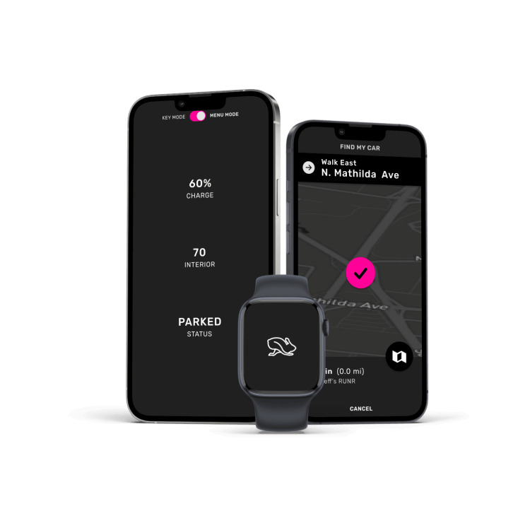
01 Mobile
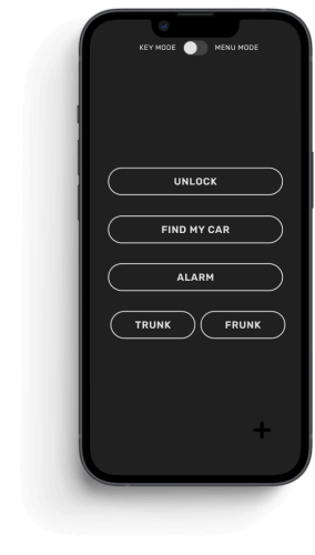
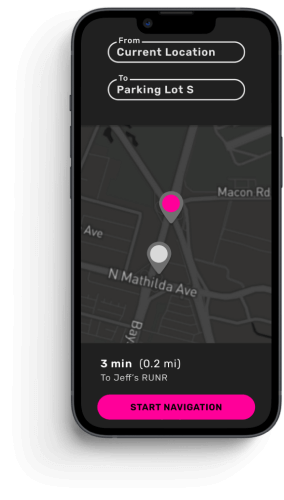
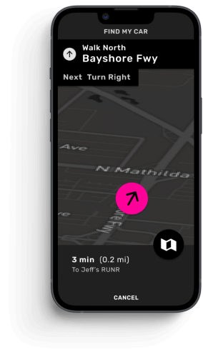
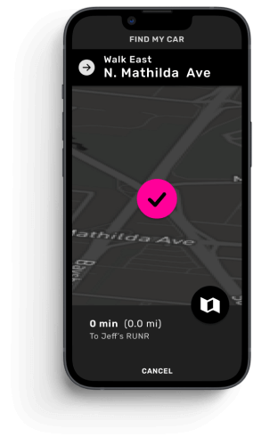
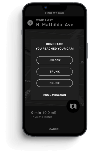
First, the driver locates the vehicle in a crowded parking lot using the "find my car" feature on the RUNR mobile app.
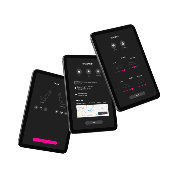
02 Dashboard
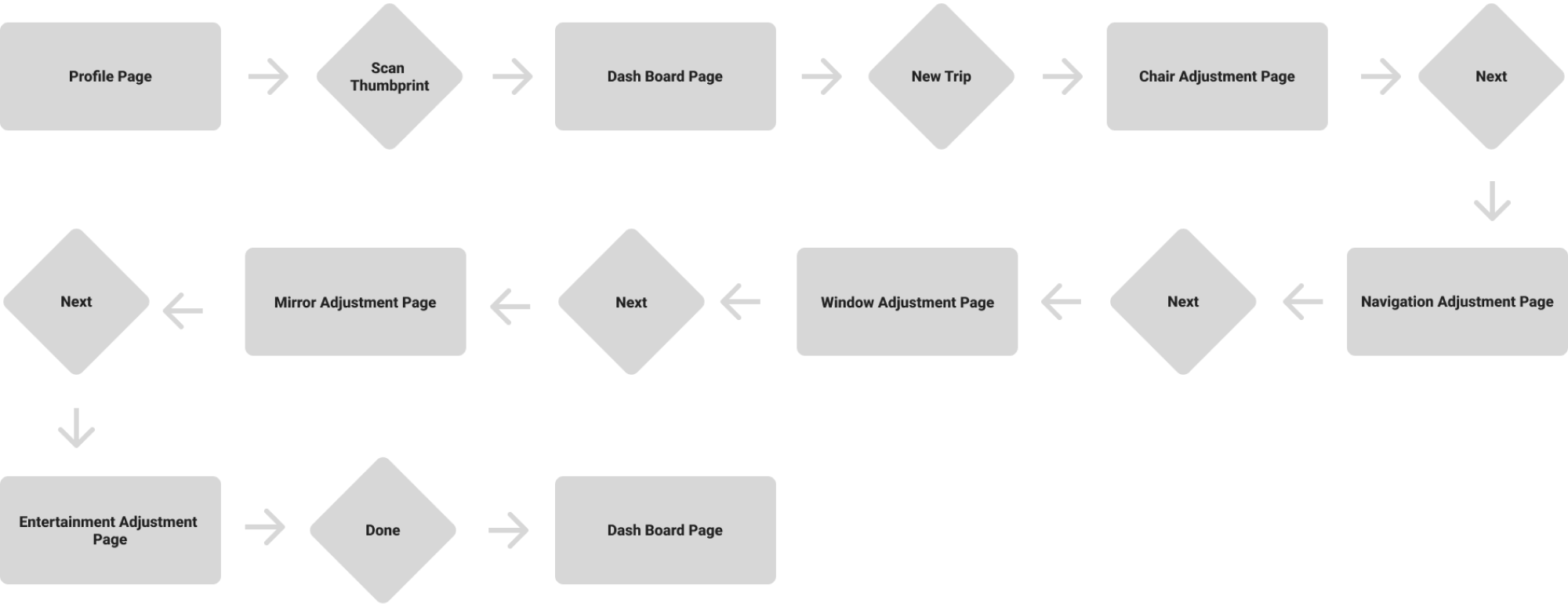
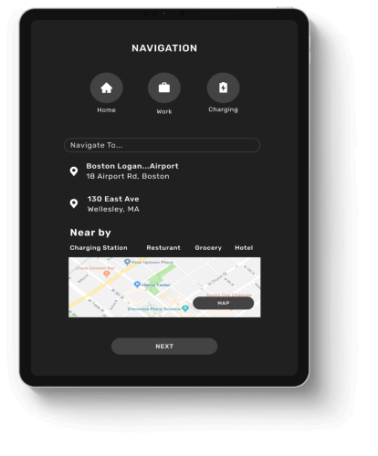
Second, the driver programs a new trip using the RUNR digital dashboard.
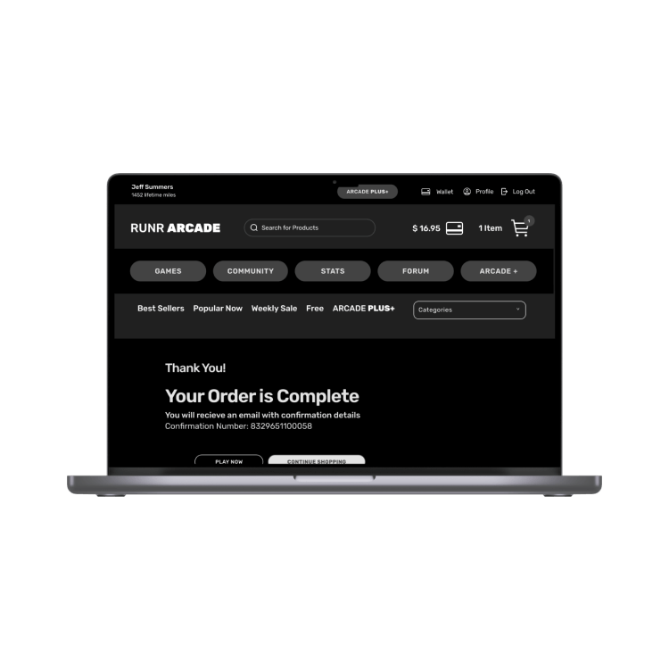
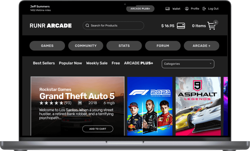
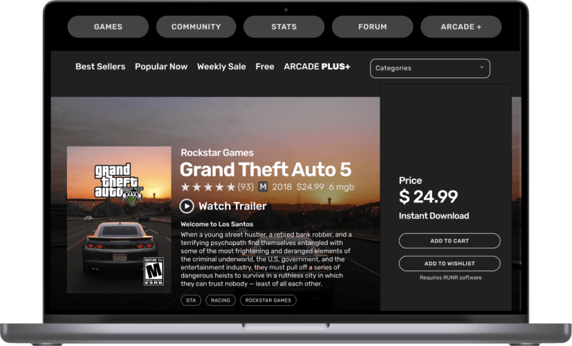
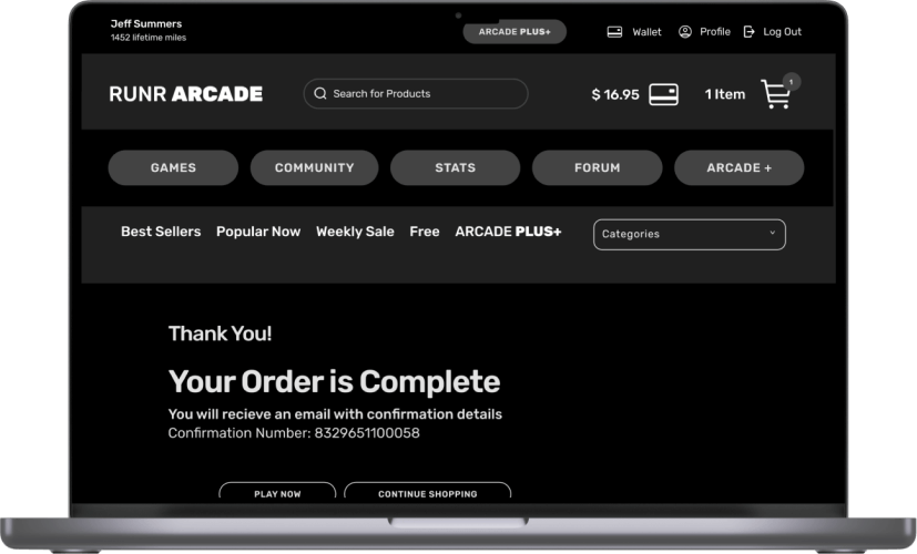
03 Website
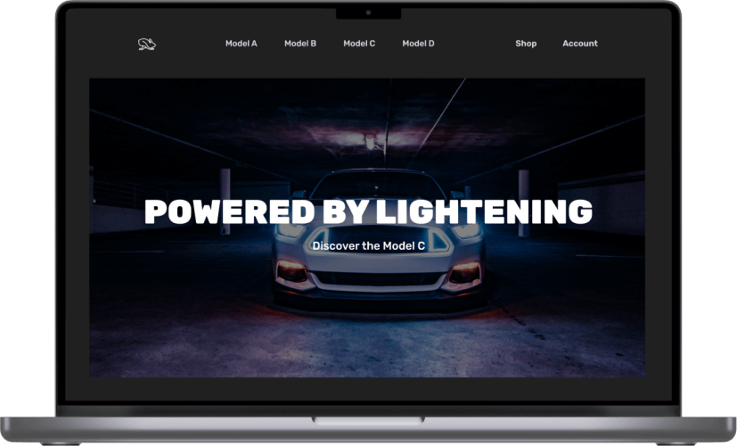
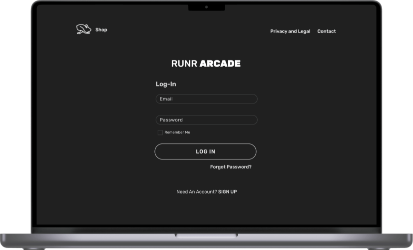
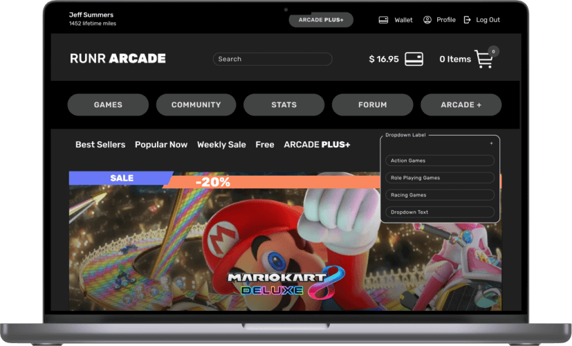
Third, the driver visits the RUNR desktop website to buy a new game and download it to their vehicle.
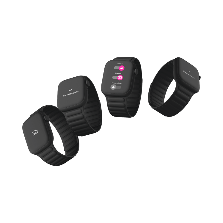
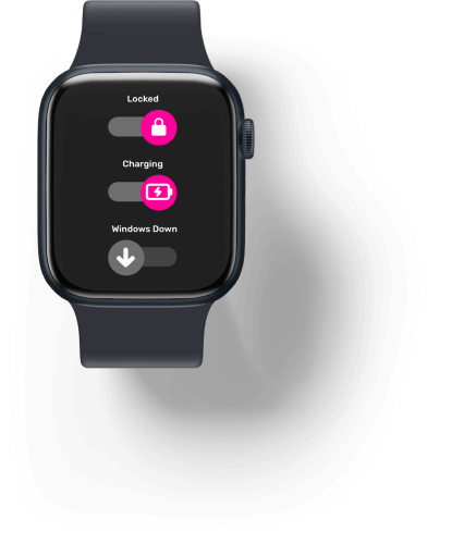
04 Wearable
Lastly, the driver remotely locks & checks the vehicle's status using the RUNR wearable app.
Screens
01 RUNR MOBILE
Mobile Experience
Unlock Car
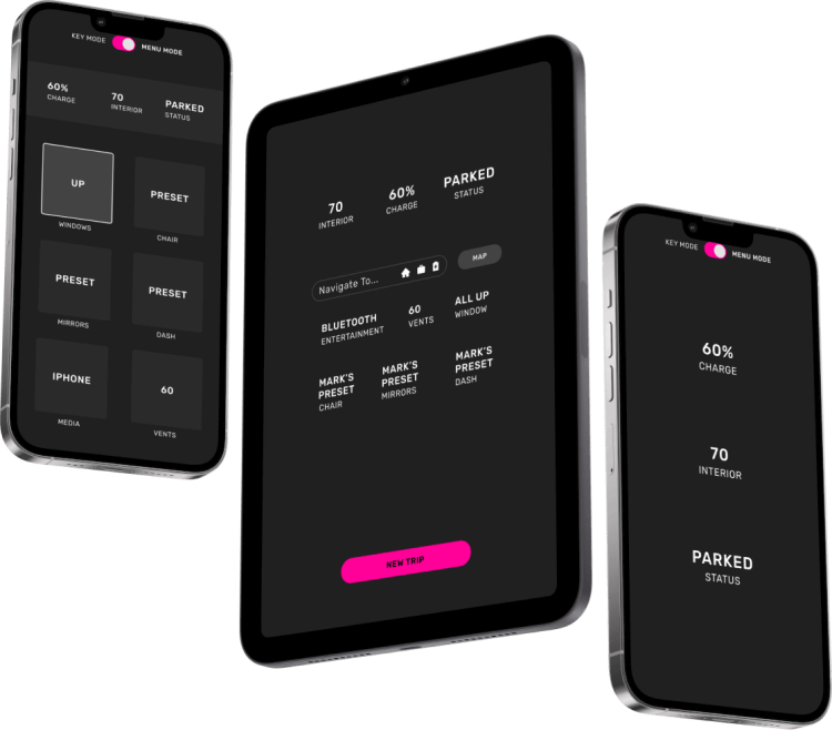
The driver can lock, locate, and check the status of their vehicle from anywhere using the RUNR mobile app.

02 RUNR DASHBOARD
Digital Dashboard
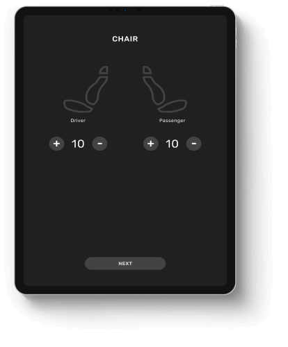
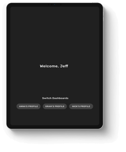
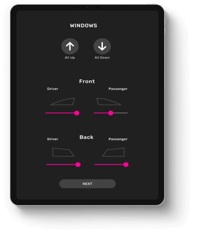
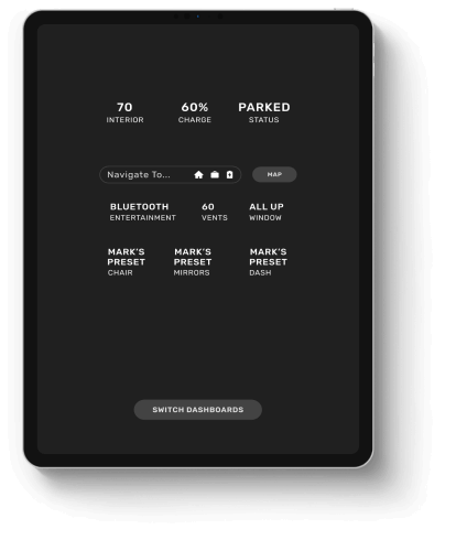
Set Up New Ride
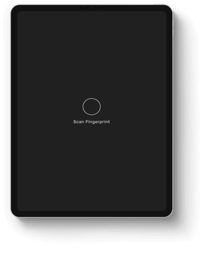
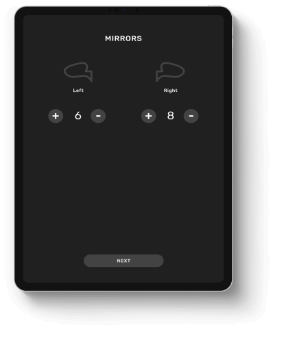
After turning on the car using biometrics, the driver can customize and save their preferences for future trips using the digital dashboard inside every RUNR vehicle.

03 RUNR ARCADE
Desktop Experience
Download Features
Drivers can buy games and features from the RUNR Arcade website to download directly to their vehicle.

04 RUNR WEARABLE
Watch Experience
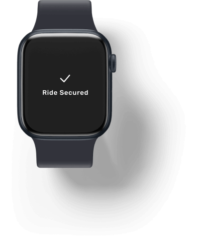
Secure Vehicle
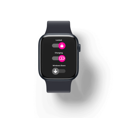
Drivers can remotely secure their vehicle and control the locks, windows, and charger with the RUNR wearable app.


Conclusion
Summery
RUNR explores the future of vehicle UI and branding.
This is a project with three deliverables - The Figma component library, the branding guide, and the four device screens which apply the design system.

Components
After building, using, and maintaining a library of Figma components, I will apply this design system experience to all future design projects for a more cohesive look & streamlined prototyping process.

Branding Guide
To create the RUNR branding guide, I thought about what direction the vehicle industry is headed and what needed to change to appeal to a younger audience.

Design System
Applying my design system across desktop, mobile, tablet, and watch dimensions, I have a new appreciation for minimalist designs that maximize flexibility and easy customization.
Keep Exploring!

Motion DesignMotion Graphics

Cookie CouponsUI/UX Design
Exercise LegendsUI/UX Design

Rare ColorsUI/UX Design
ArtTagCapstone Project

BB&B UniversityUI/UX Design
Connect
Lucie Robert 2022
